Are you organising an event and want people to know about it? In this case, advertising with an event poster is the simple yet best solution, from banners to billboards, from social media marketing to invitations. This solution works for everything from a rocking party or fabulous concert to a corporate event or formal business. The secret here is to design the poster in such a way that it can inform, attract and get the targeted people interested. Before creating any event poster, one should analyse the global impact of the event industry to know exactly what is the best match. In this article, we have listed a variety of awesome posters from which you can get ideas and design your perfect and engaging event poster. To make the process even simpler, you can also use an online events poster maker, which offers intuitive tools and templates to bring your vision to life effortlessly.
Party event posters:
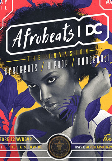
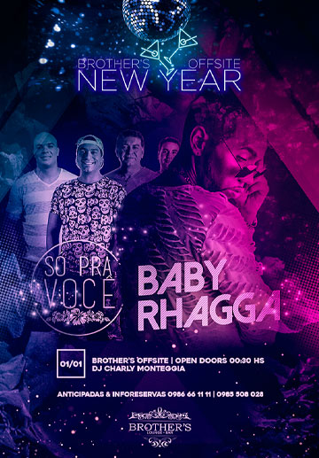
Similar to the parties, this poster collection features various designs, hues, and aesthetics. When you see them, though, they all have a trait in that you know what to expect and are drawn to be there. The list goes on: retro beach party with typography, Fred Events with colour and visuals that scream afrobeat, and Trystero with minimalistic simplicity. As you will see, the design completes the information rather than detracting from it.
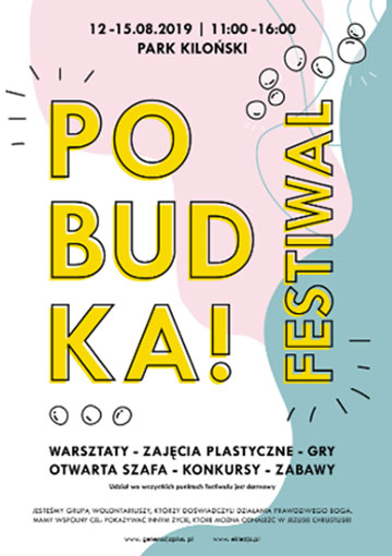
Festive, fair and concert posters:
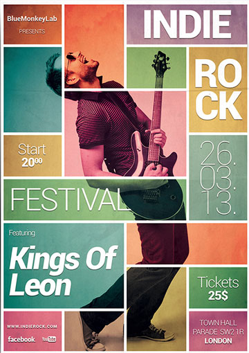
These excellent poster examples market a brand rather than just an event. The posters are eye-catching, long-lasting visuals that make excellent use of colour, typography, design elements, and pictures to stick in your mind and draw in your curiosity.
Conference posters:
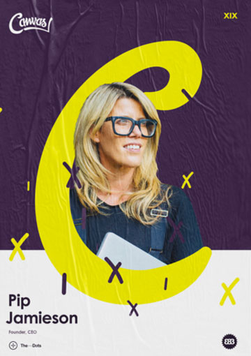
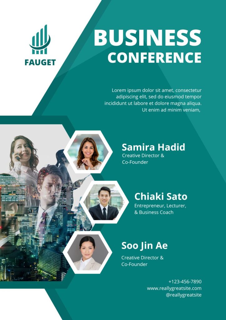
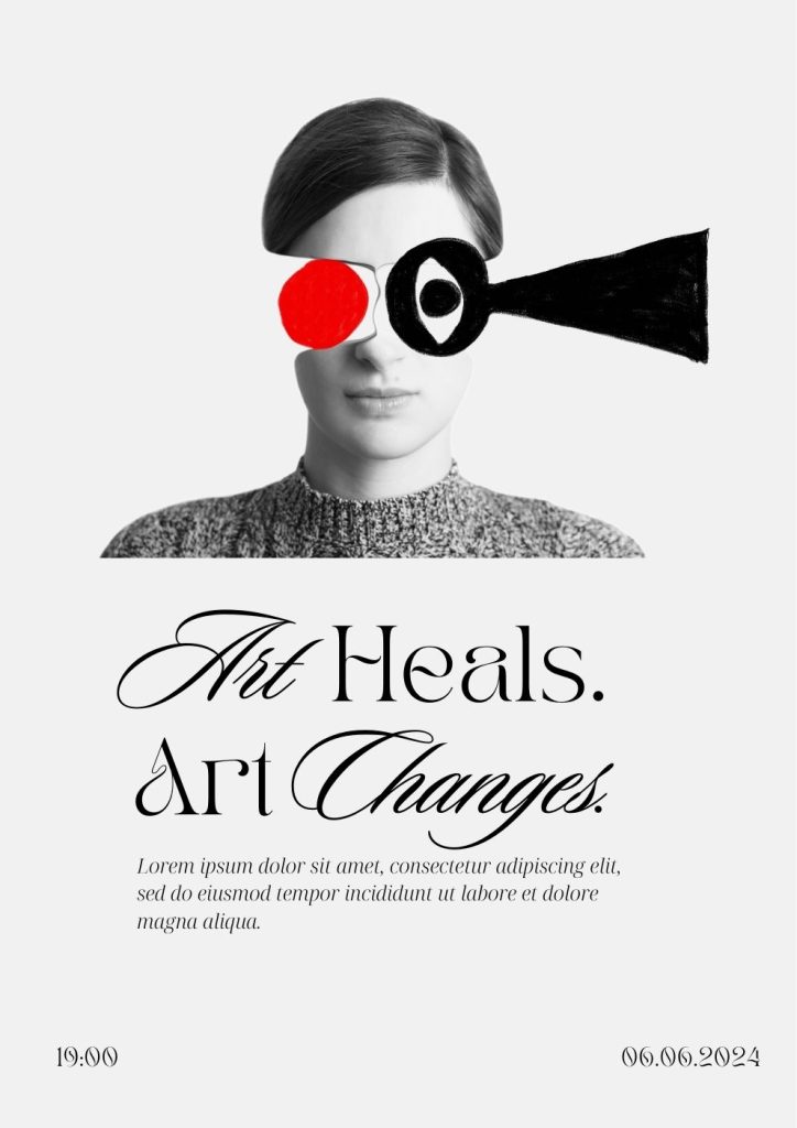
The following are some excellent examples of how to make your conference poster stand out from the crowd. Let’s immerse ourselves in the topic as they want to draw in knowledgeable people. The first poster proves that we know what we are discussing if you wish to attend a conference on collage and typography.
Film festival event posters:
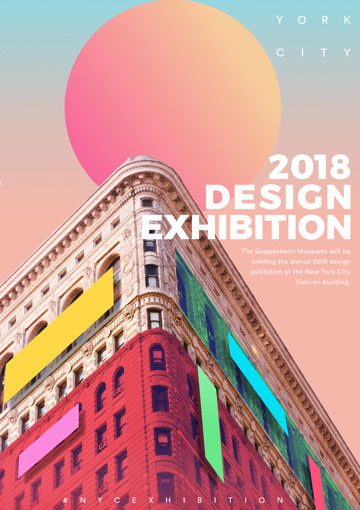
A film festival poster is an opportunity for creativity, and the examples below show how to achieve it in various ways. Once more, the goal is to draw moviegoers, art enthusiasts, and cultural vultures. The greatest examples tie the event to the audience through traditional methods. Mon uses Chaplin, a camera, and popcorn images in a striking orange, blue, and white colour scheme. Again, with little use of colour, Byron Bay relies on a graphic camera symbol and employs icon pictures to create the festival’s physical environment. Using abstract Picasso-like graphics and hues, Mostra Internacional connects the movie to art.
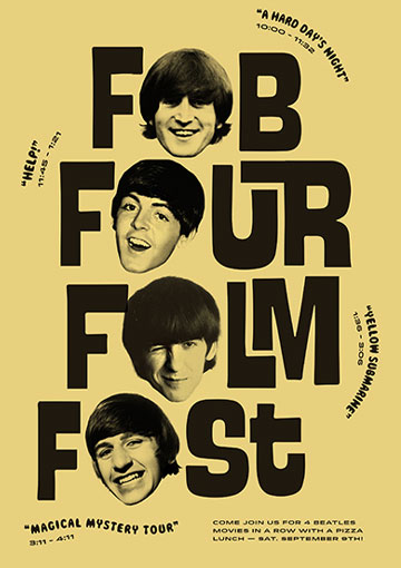
Dramatic event posters
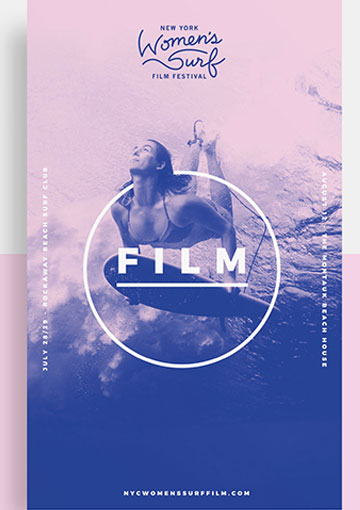
Here is Nike’s New York ad, which contrasts muted monochromatic with gaudy, loud, and attention-demanding graphics. The Night Market Event’s soft pastel colours offer a comforting impression, but the Arabian hookah employs magnificent purple and gold tones to create an extravagant and exotic surprise. With graphics and hand-written style typefaces, the Sip-N-Stitch event poster embodies the handmade vibe. Different designs for various settings.
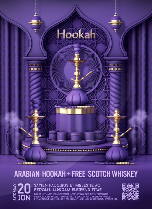
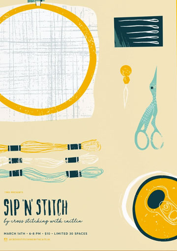
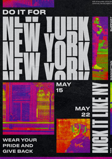
More different event poster examples:
Event posters with unique ideas and eye-catching designs mostly attract more attendees. Here are some such event posters from various events, so we can share more poster ideas with you for your next event.
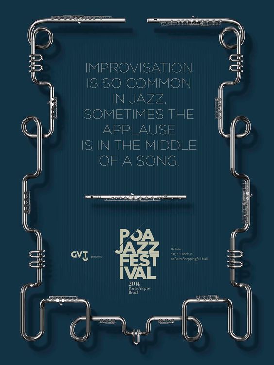
Using eye-catching border:
You can use a border with an eye-catching design, such as this one from the POA Jazz Festival. The trumpet has an exciting appearance because of how the edge is bent.
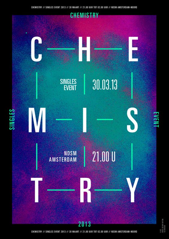
Changing reading style:
Don’t we often read from left to right? By making it clear that we must read the poster in its entirety to view all of the text, Milan Van De Goor’s Chemistry poster breaks the established rules.
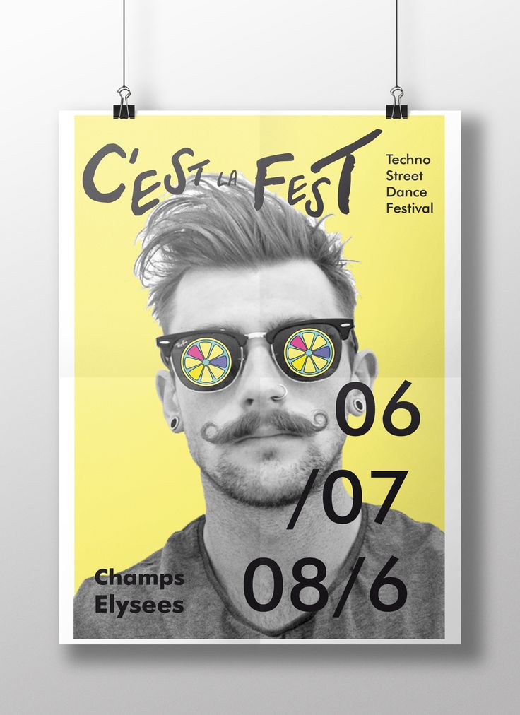
Consider using retro style:
The Techno Street Dance Festival is promoted in this groovy retro pop-art style.
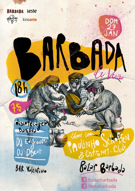
Use creative font style:
This Barbada poster combines intriguing font styles that are unique to it to grab attention.
Try doodling
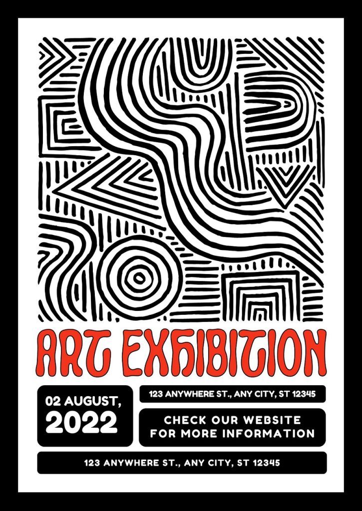
Like the festival’s name, this poster’s design has a spontaneous feel to it. It appears as though someone has just drawn over the top of the poster because of the marker pen.
Highlighting key information using pointers
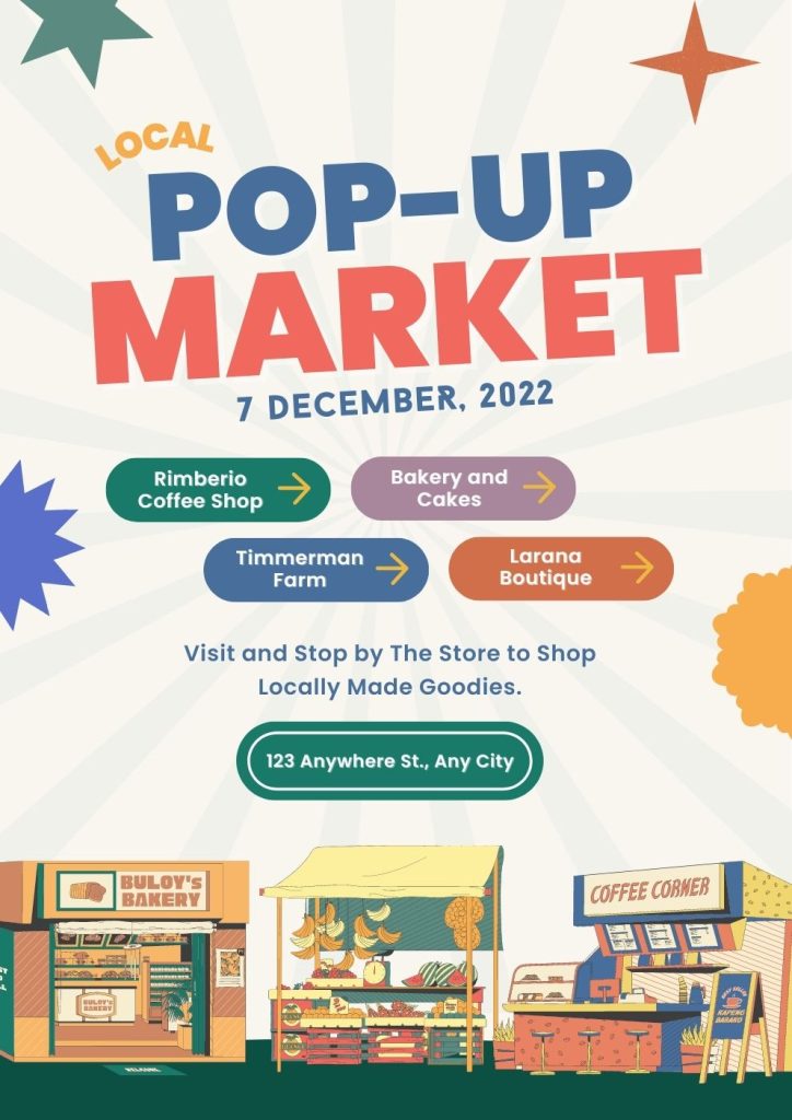
Using graphical pointers, this Lovejoy poster guides you to various parts and provides all the event-related information you may require.
Try layered graphics
It’s difficult to ignore this type of poster because of the wonderful effect it creates.
Use primary colours:
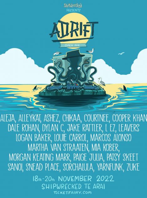
If you want your poster to be visible from a distance, choose primary hues like red and blue, as this Ship Wrecked poster indicates.
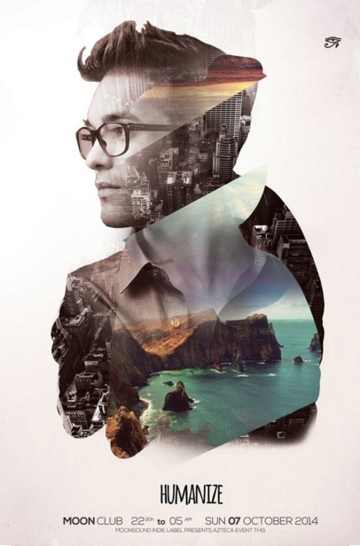
Adding double exposure effect:
A fantastic double exposure technique, which combines two pictures into one, is used in this Humanise poster.
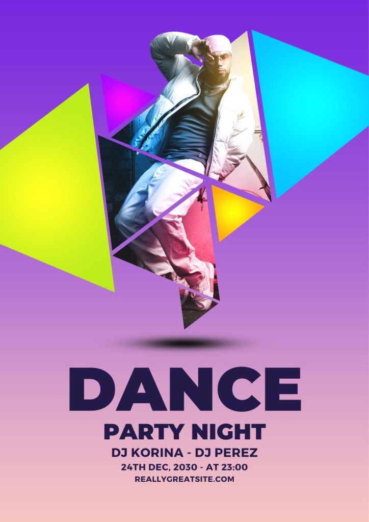
Consider using one shape extensively:
Triangles are used to capture the attention of this poster. The shape really stands out since triangles are so prevalent.
Try shock value
You can get people to glance at your poster by creating something unique.
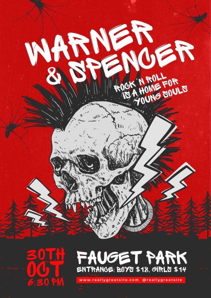
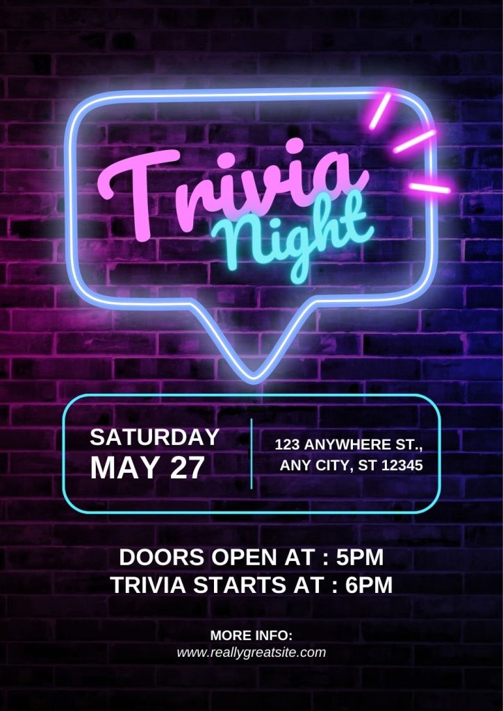
Add strong block text:
This James Rivas New York Photo Festival billboard grabs attention immediately because of the use of bold capital letters. Try to fit as much text as you can into a compact area.
Using objects related to the theme
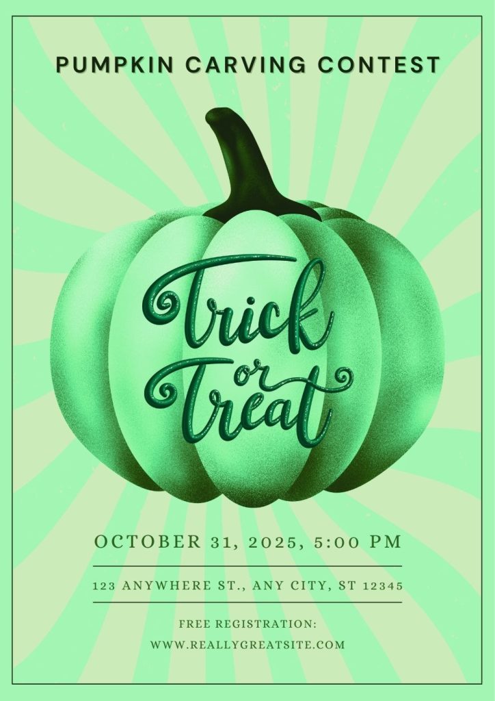
The edges of the poster for this Pumpkin Carving Contest is decorated with pumpkin which highlights the phrases inside.
Create landscape version:
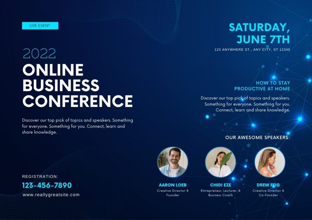
A simple layout modification can completely change the game. The poster for the Earth Frequency Festival is landscape-oriented, and you can follow this technique.
Try inverted iconography:
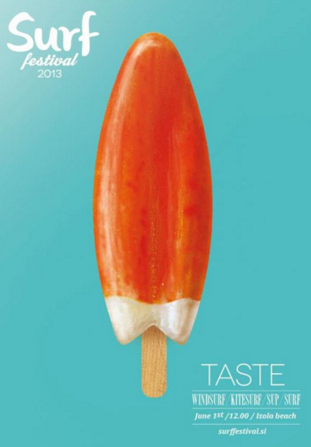
To advertise their festival, Surf Festival utilised a poster with an ice-lollies-like form. The ice lolly draws the eye of curious surfers because it resembles a surfboard.
Add recognisable shapes:
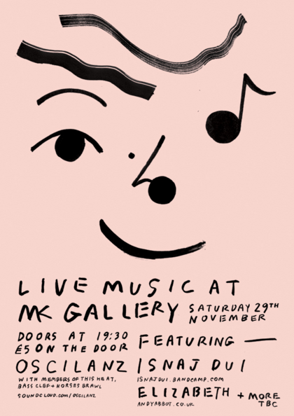
There is no more common sight than a human face, and Wai Wai Pang’s MK Gallery billboard combines musical notes to provide the appearance of a happy face, which can derive passers-by’s attention.
Pop-up with colours:
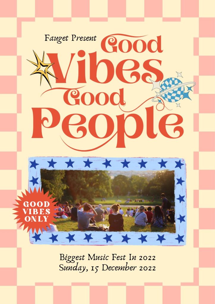
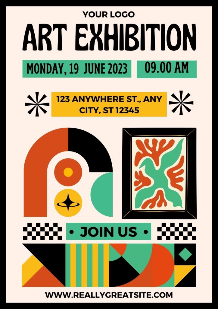
Be bold while using colour! Create a poster with vibrant hues, like this one. It is so brilliant that you cannot miss it.
Try a glow effect:
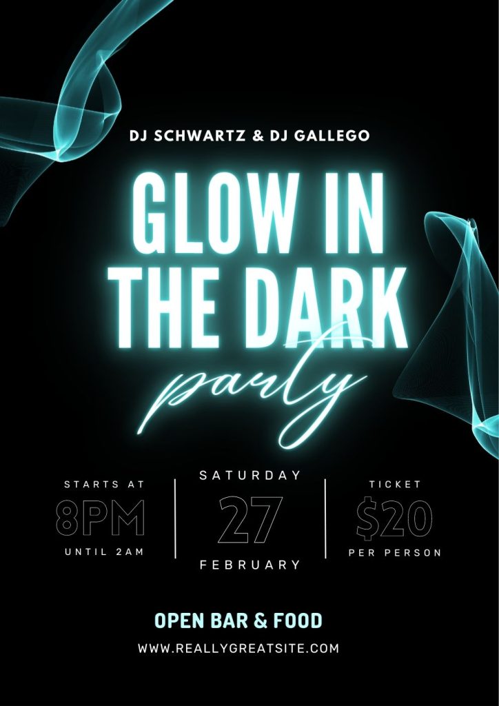
Why not give your poster a straightforward glow effect? The glowing phrases of TGlow in the Dark provide a wonderful aesthetic.
Using 3D shapes:
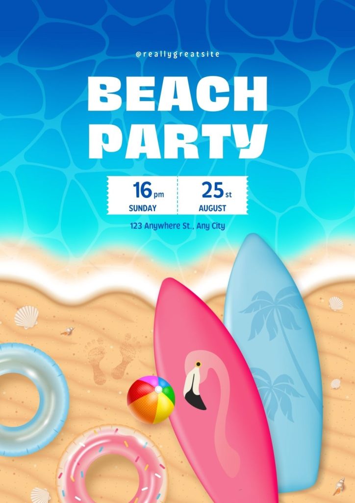
You are pulled to this Beach Party poster because of the interesting-looking 3D items, which are also formed with colour effects.
Add interest using perspectives:
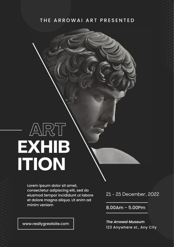
The man and the event detail are just a few of the spots on this poster where the use of perspective pulls the eye.
Try complex illustrations to draw attention:
Complex illustrations can also serve as a great way to attract viewers’ attention. This image makes use of several complex textures and forms.
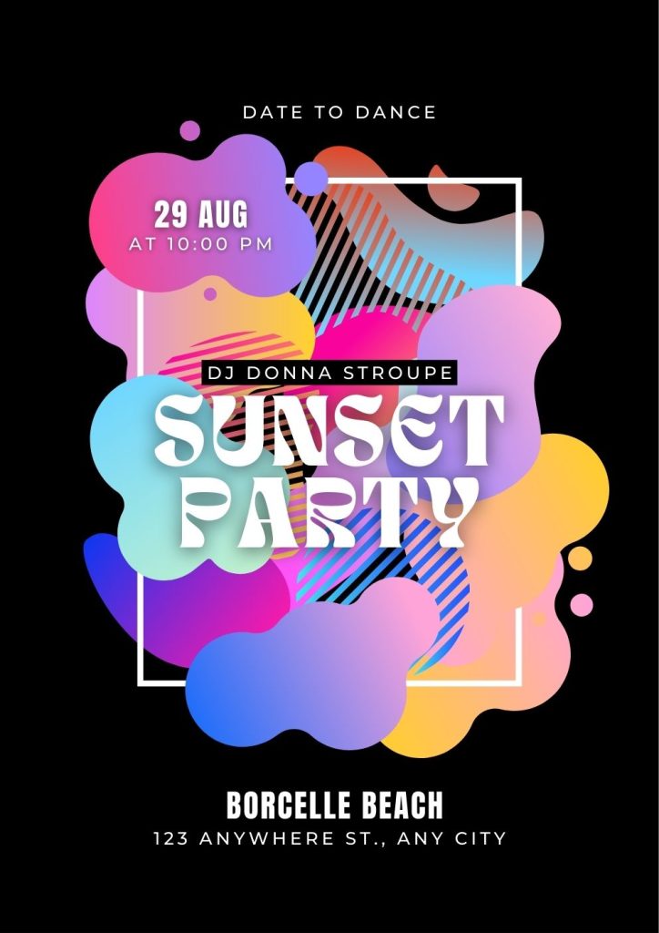
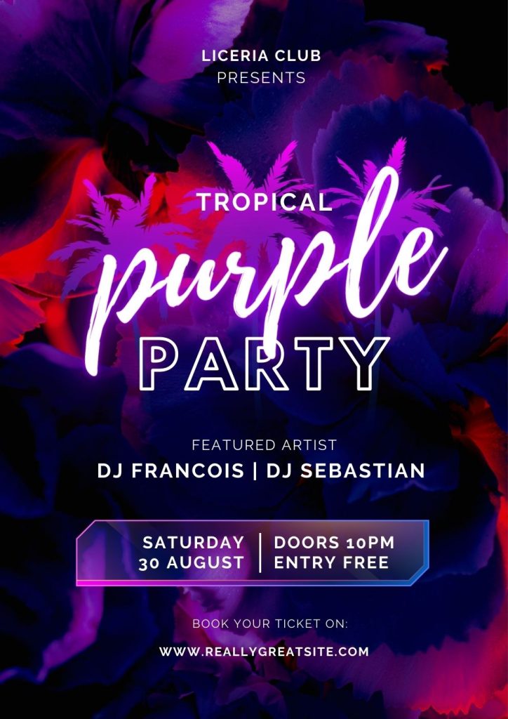
Using simple 2D graphics:
Liceria Club’s poster employs a straightforward 2D design to publicise their event. Even the simplest things may be gorgeous.
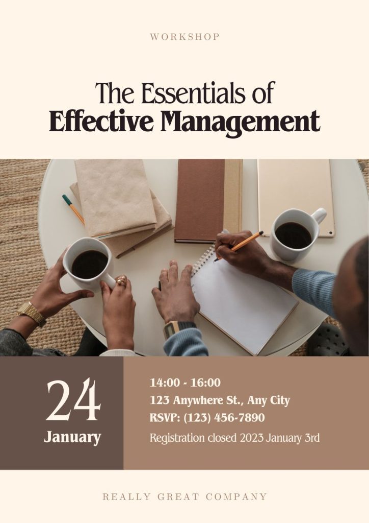
Positioning headline for impact:
Like this fantastic workshop event poster, a headline placed directly on the page will draw attention to your event.
Try only two colours to draw the eye:
This poster definitely stands out even though it just uses two colours. You can also use this simple yet tricky idea in your event poster to draw maximum attention.
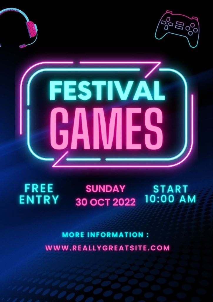
Use neon bright to draw attention:
When placed over a dark background photograph, the neon hues in this poster provide an arresting effect.
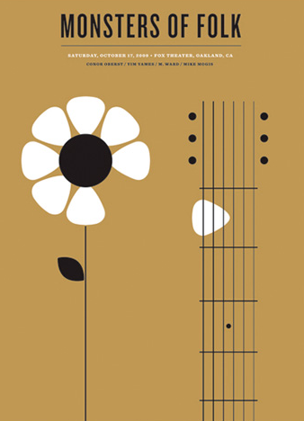
Add double-meaning icons:
Is that a flower or a plectrum? You’re driven to think about Jason Munn’s brilliant design for Monsters of Folk.
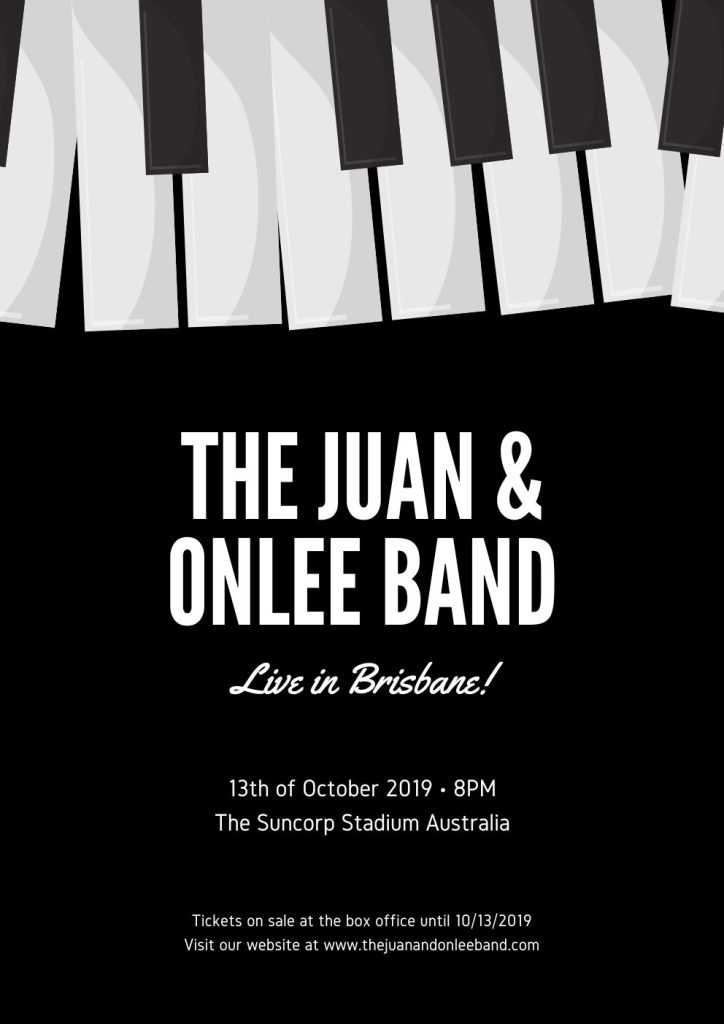
Make illusion with inverted shapes:
The advertising for the band event in Brisbane has an ethereal air because of these interesting inverted forms.
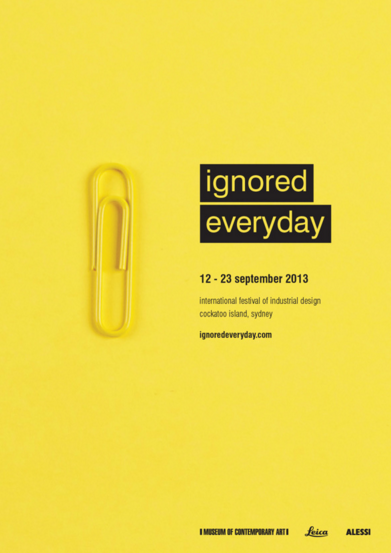
Simplicity is a beauty:
Event advertising doesn’t have to be difficult, as this wonderfully simple poster by the International Festival of Industrial Design demonstrates.
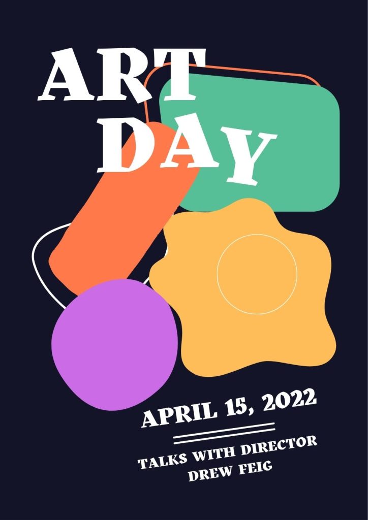
Add a black background:
As seen by this poster for the Art Day Festival, black can always make something stand out.
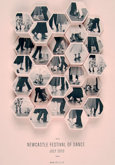
Mixing old with the new:
Amy Rodchester created a poster for the Newcastle Festival of Dance that combines contemporary typography and forms with vintage images of dancers from earlier times.
Try crazy posters with lots of details:
Anything is acceptable when the laws are broken. Try a wild poster with loads of detail. It makes a declaration about who they are.
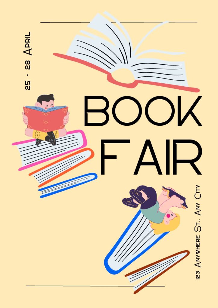
Consider creating recognisable shape:
The Book Fair Festival hopes to attract attention by forming a shape like books.
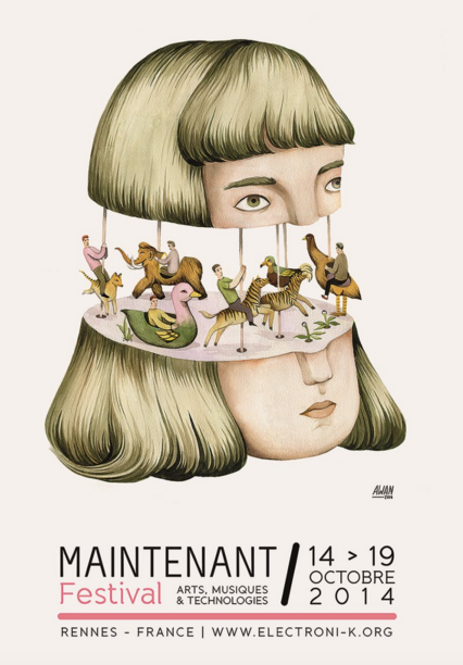
Use surrealism:
Why not shake things up and go all surrealism like this Andrea Wan poster for the Maintenant Festival?
Mix match two slots of massaging to draw attention:
It’s difficult to avoid looking at this poster; it’s so busy! To capture your audience’s interest, try stacking your media.
Use diagonal line:
The event poster is deceptively easy to read and arranges its content in diagonal lines.
Play with images literally:
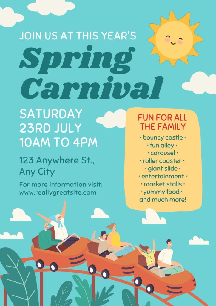
Do you want to publicise a festival with a catchy poster? Why not include items on your event poster that tell you everything you need?
Add special effects:
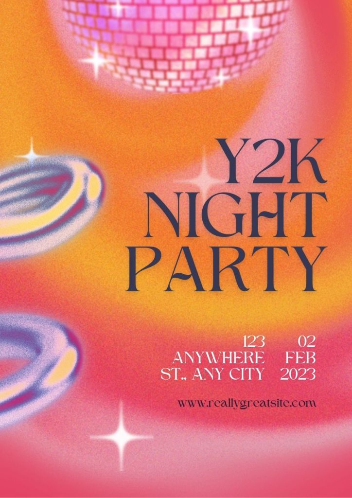
Special effects are used in this party poster to advertise the event.
Last words:
Event posters are like a mirror that reflects the pros and cons of an event in front of people. It is the first thing that makes the event visible to the attendees. These posters even help to sell event tickets online and offline as well. From the above poster example, you choose any idea or combined more than one idea to design your engaging and most attractive event posters.
To sum all up, if you are related to the event industry and get confused every time to make the right decision about your event EventBookings, the best event management company can help you. We will help you with the following:
- Monetising your event
- Corporate event photography tips
- Leveraging Analytics to improve ticket sells
- Risk management planning, and many more.
References: Canva | Behance | Really Good Designs | Ticketbooth
